


There are 7 types of images that typically appear in the exam:
- Bar Graph
- Line Graph
- Pie Chart
- Table
- Process Diagram
- Map
- Venn Diagram
Take a look at the following PTE Describe Image Practice Template to score better in this task:
BAR GRAPH
There are two forms of bar graphs that seem within the exam- vertical and horizontal bar graphs.
- It’s important to start the outline of a bar graph by means of pointing out the name of the subject, exactly as it appears at the graph. In the second one and 3rd sentences, it’s possible you’ll state the highest and lowest figures on the graph, in any order.
- Next, you can speak about any similarities, large variations or another important option that may be noticed obviously within the graph.
Sample PTE Describe Image Practice Template:
This horizontal/vertical bar graph depicts the information referring to_____. The data is presented/calibrated in_____. It’s crystal clear from the graph that _____ has the highest _____, at _____, while _____has the lowest, roughly _____. Apart from that, _____ and _____have almost equivalent _____, roughly _____. In conclusion/Overall, it may be noticed that _____.
Solution:
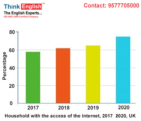
This horizontal/vertical bar graph depicts the information referring to household with the access of the internet. The data is presented/calibrated in percentage. It’s crystal clear from the graph that 2020 has the highest percentage, at 70%, while 2017 has the lowest, roughly 60. Apart from that, 2018 and 2019 have almost equivalent percentage, roughly 60. In conclusion/Overall, it may be noticed that gradual increase was there from the year 2017 to 2020.
LINE GRAPHS
There are basically three forms of line graphs that appear within the exam- single line, parallel line, and cross/multiple line graphs.
In line graph tasks, describing “trends” is of maximum significance. You’ll be able to divide the outline of every line graph into three portions: the beginning value, the center value and the final price.
It will help to use vocabulary such as:
“The figures fluctuated between _____ and _____”
“The figures rose sharply to reach a height of _____”
“The number gradually declined to reach a low of _____”
“It gradually rose, peaking at _____”
“The quantity in the end lowered/higher to _____”
“After a number of ups and downs, it touched a height/low of _____”
Sample PTE Describe Image Practice Template:

This line graph highlights the _____ over a period of _____ from _____ to _____. The quantity used to be highest in _____ at _____, and the quantity regularly declined, to reach a low of _____ in _____. On the other hand, in _____, the number of _____ used to be the lowest in _____, and it gradually rose, peaking at _____. In conclusion/Overall, it may be noticed that ____.
Solution:
This line graph highlights the Dubai gold sale over a period of 2020 from Jan to Dec. The quantity used to be highest in March at 350 millions of dollars, and the quantity regularly declined, to reach a low of 100 million dollars in July. On the other hand, in July , the number of 100 million dollars used to be the lowest in 2020, and it gradually rose, peaking at 200 million dollars. In conclusion/Overall, it may be noticed that fluctuation was observed in the given data.
PIE CHART
This is without doubt one of the highest images to explain, with every slice of the pie chart similar to a value, you’ll be able to merely point out the highest and lowest figures and another important characteristic that may be noticed very clearly within the pie chart.
Sample PTE Describe Image Practice Template:
The slices of the pie chart illustrate _____. The data is presented in form of _____. It’s crystal clear from the pie chart that the lion’s percentage of _____ is covered by _____, followed by _____. On the other hand, the smallest part is covered/occupied by _____. In conclusion/Overall, it may be stated that _____.
Solution:
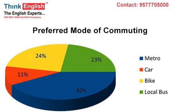
The slices of the pie chart illustrate preferred mode of commuting. The data is presented in form of percentage. It’s crystal clear from the pie chart that the lion’s percentage of preferred mode of commuting is covered by metro, followed by bike. On the other hand, the smallest part is covered/occupied by car. In conclusion/Overall, it may be stated that metro is the most preferred mode of commuting and car is the least mode of commuting.
Similarly other images can also be attempted with the help of these predefined lines.
TABLE
Sample PTE Describe Image Practice Template:
This table depicts _____. It’s crystal clear from the table _____. On other hand, _____. It is usually evident that _____. Overall, it may be inferred from the table _____.
PROCESS DIAGRAM
Sample PTE Describe Image Practice Template:
The given procedure diagram displays the life cycle of a/an _____ in more than a few/other steps/stages/procedures. To start with/In the first step/level, _____. Moreover, it’s transformed/advanced/converted into _____. After someday/Within the subsequent level, it’s additional transformed/advanced/remodeled into _____. In spite of everything, _____.
MAP
Being aware of the names of nations makes it more uncomplicated to explain images in response to maps. In case you are not able to memorize the names of the entire nations, attempt to memorize the names of a minimum of those nations that seem regularly within the information. When you fail to remember the names, it will assist to make use of phrases like Northern nations, Western nations, and many others.
Sample PTE Describe Image Practice Template:
The given map displays _____ among other nations. First of all, nations within the West such as _____ and a few portions of _____ are _____, followed by nations within the East such as _____. Then again, developed and creating nations such as _____ and adjoining nations are _____. Finally, in _____ and at the centre of the map, _____. Overall, it may be noticed that almost all of areas in _____.
VENN DIAGRAM
Sample PTE Describe Image Practice Template:
The given Venn diagram depicts details about _____. It’s crystal clear from the Venn diagram, that _____. At the flip side/On the contrary, _____. On the other hand, they also share positive traits, such as _____.